Accessible &
inclusive design
Challenge: How to implement accessible and inclusive design into their current webpage. The European accessibility Directive entails a legal requirements for accessibility in digital products starting from June 28, 2025. Guidelines such as WCAG (The Web Content Accessibility Guidelines) and other best practises is a keyfactor to achieve these goals.
Platform: Desktop version.
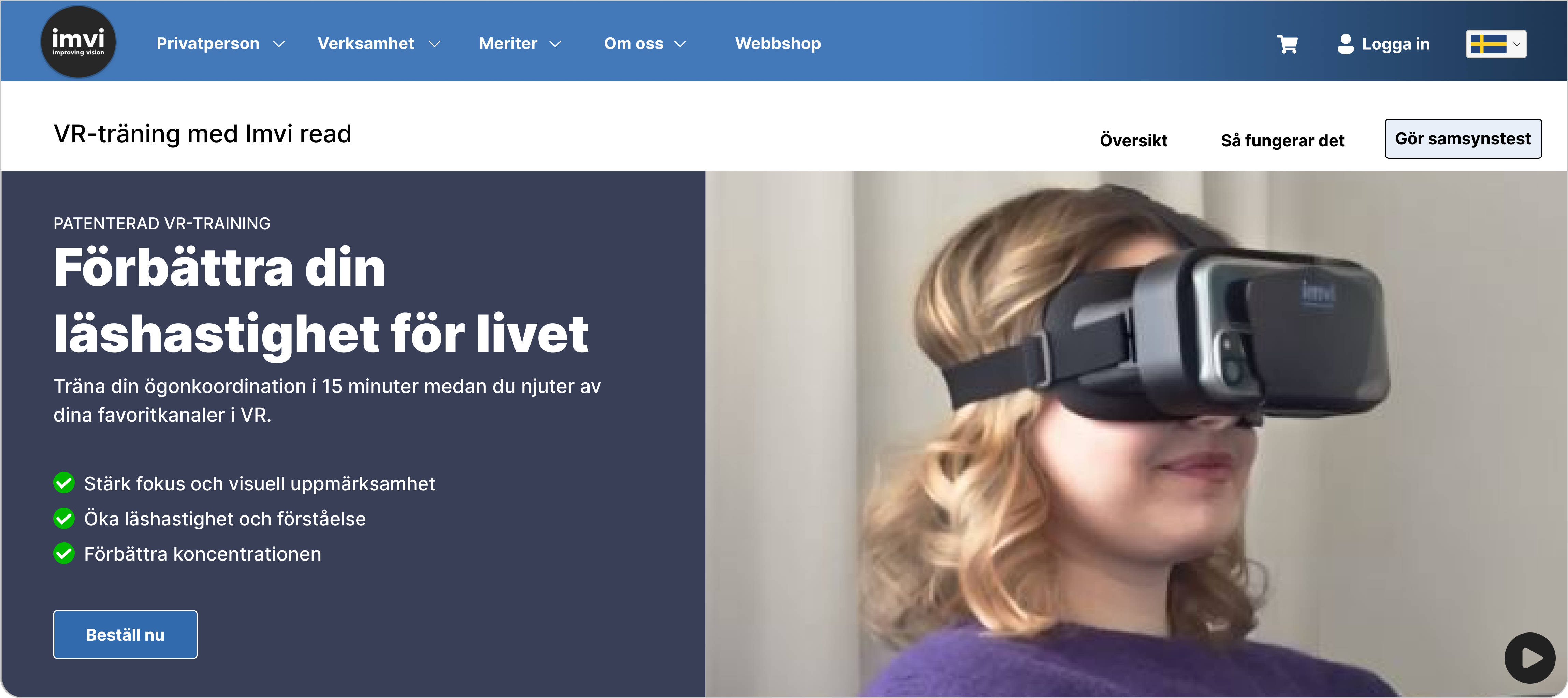
The goal of this particular project is focused on their webpage Imvilabs.
Reading time: 5-8 minutes
Role
UX-designer, User research, Accessible design, Prototyping & Testing
Project time: 9 weeks
(January-march 2025)
Working solo
Company:
Sector
School project, Education, Real case
Quick access to prototype
Prototype language is in swedish
Background
Imvilabs is a a Swedish startup company who focuses on helping individuals to improve their reading by using VR-training (Virtual Reality). Imvilabs owns a
VR-patent for this specifik technology which is implementetd into their mobile application. The development behind this application has a 15 years of science collaborating with Swedish universities such as Karolinska institute.
The VR-training started with the intention to help individuals with convergence insufficiency to coordinate their eyes which improves their focus and reading.
This method also shown to help individuals with other diagnoses such as ADHD, dyxlexia, double vision and stroke.
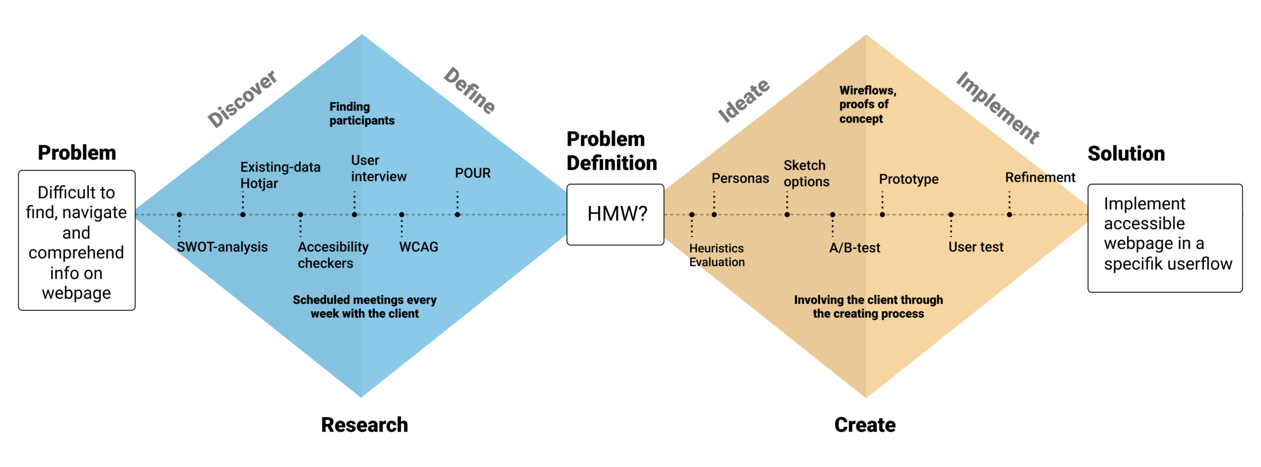
The process
My framework for the designprocess has been mostly based on ”The Double Diamond”. These are the following methods I’ve used and implemented in the designprocess:
- Quantative method
- Hotjar – heatmap and behavior analytics tools.
- Qualitative method
- User interview
- Accesibility checkers
- Personas
- User testing
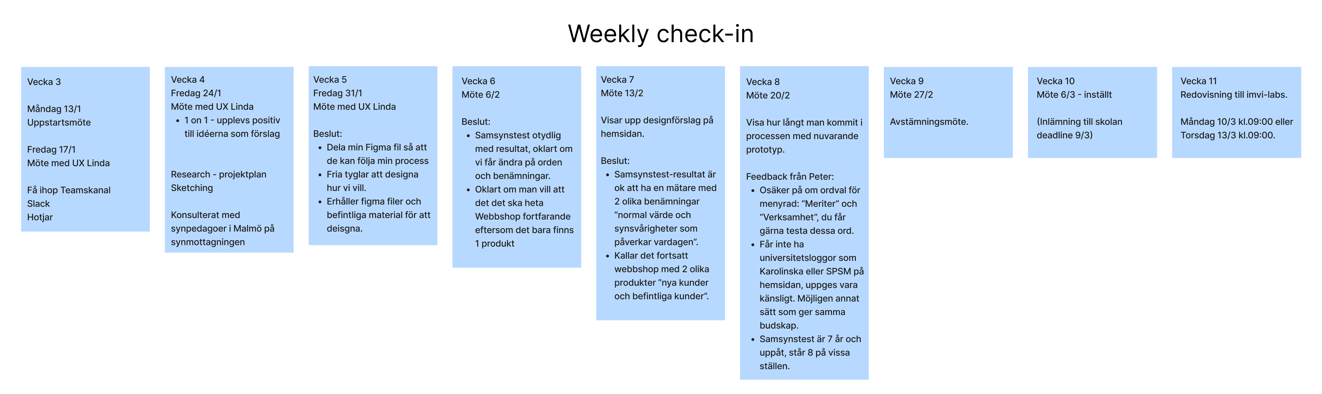
- Weekly meet-up with the client: expectations, demands and delivery.
- Guiding tools
- HMW – ”How might we?” questions
- SWOT-analysis
- WCAG – Web Content Accessibility Guide.
- Software programs:

”The Double Diamond” helped me implement the mentioned methods into the framework. This was also a tremendous help for for both scoping and getting a overview of the project.
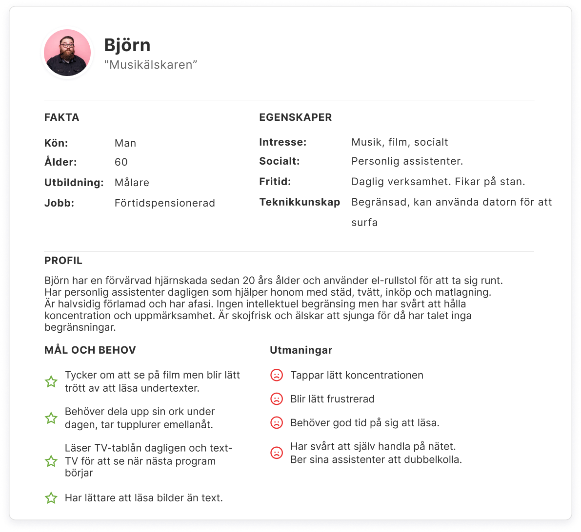
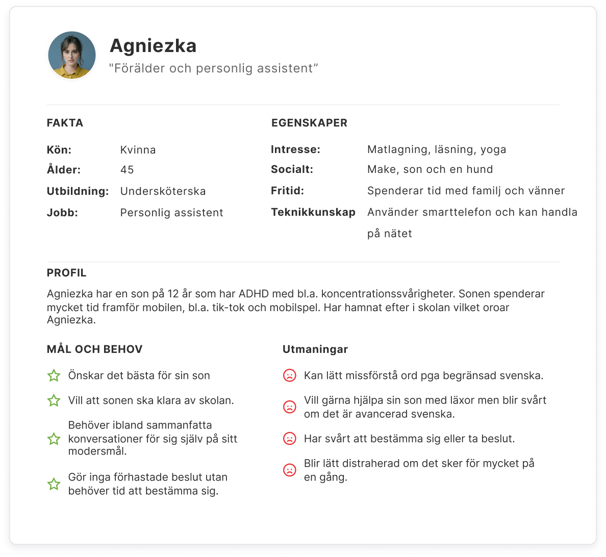
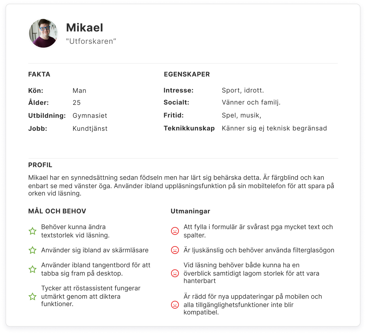
Target group
The participants for this project has been made into three different personas with different goals, needs and challenges:
Communication with the client.
Early communication has been established with the client to address the goals, needs and demands for this specifik project. CEO Peter Carlsson and
UX-designer Linda Truedsson has been thorough with walkthroughs and guidence through the project. The current issues that has been addressed are following;
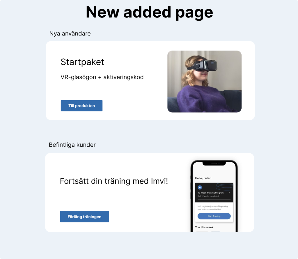
- The current webpage is overloaded with information which makes it hard for the user to comprehend.
- Lack of accessibility features on the webpage.
These issues has been mentioned in a specific user journey which has been mapped out as following:
- Homepage – Vision test (online) – Test results – Webshop – Purchase order.
I have chosen to focus on implementing accessible and inlclusive design on the mentioned user journey. The keyfactor for making this project as successful as possible is to have regular meetings with the client. A weekly check-in has been scheduled which has been tremendously helpful. After each meeting, evey decision making and feedback has been documented in a backlog.
HMW – How might we?
- How might we make the webpage less cognitive overload?
- How might we enable the webpage to be as including and accessible as possible for individuals with different disabilites and deficiencies?
These are the questions I have been trying to solve through this project.
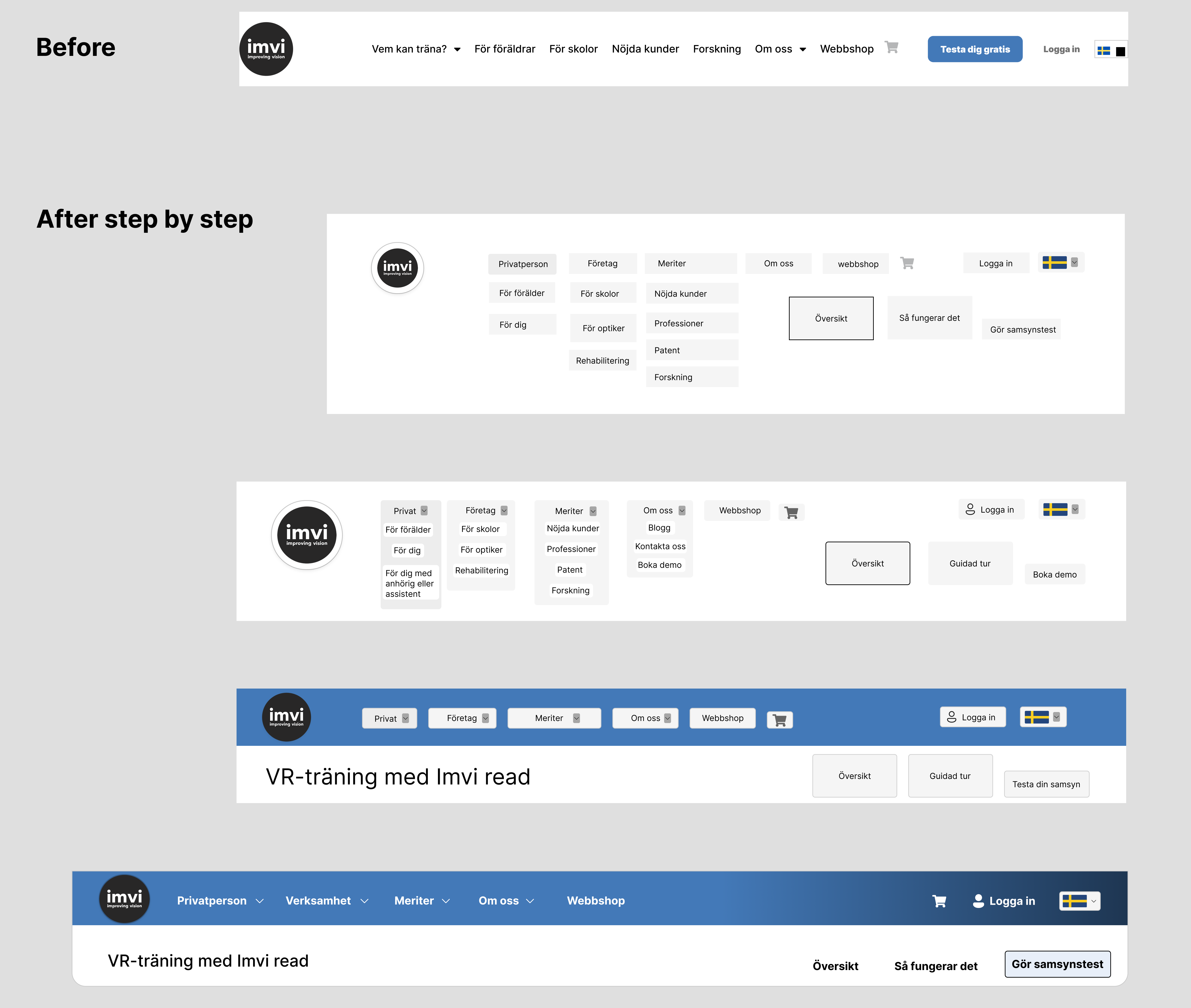
Design and iterative development.
Sketches has been made with current elements and also new features with the intention to make it more accessible and easy to navigate for the common user.
Design and iterative development: Step-by-step
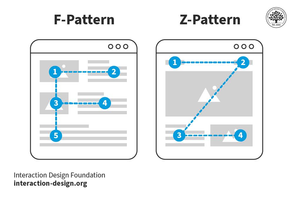
Z-pattern & F-patterns
These patterns has been implemented in the designprocess which has a essential role for accessibility. It enables content to be comprehensible for scanning or reading. Picture below explains how our eyes moves while reading in a natural way. These principles has been useful for this project.
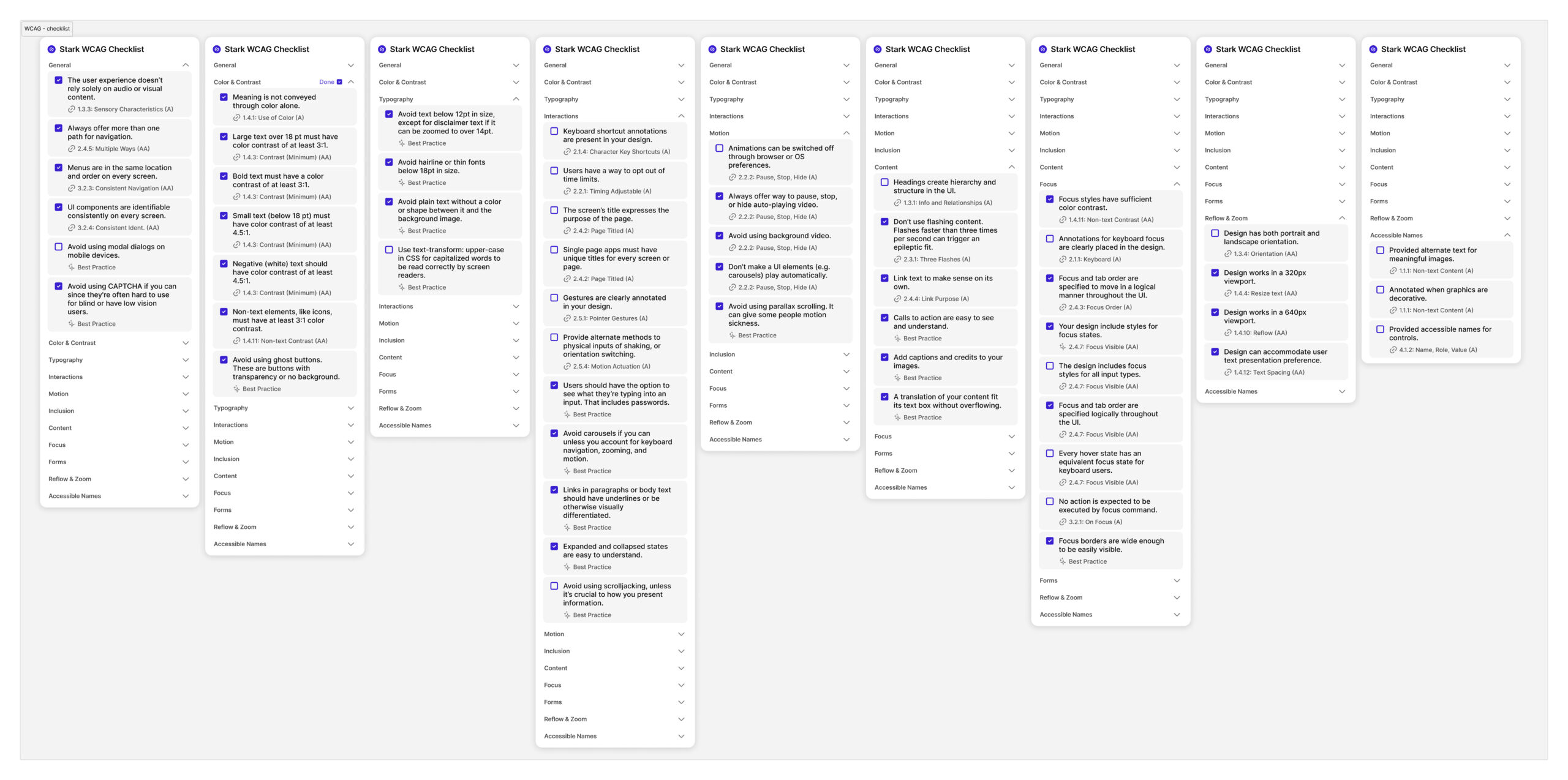
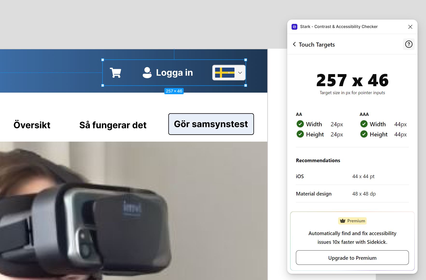
Web Concent Accessibility Guide – WCAG
Stark WCAG-checklist has been a tremendous help for guiding the design process. Every checkbox contains different standards and guidelines for what to be considered as;
- A level
- AA level
- AAA level
- Best practises
Within these guidlines the POUR – principles has also been taken into considerations during the design process;
- Percievable – visually or auditory, such as screen readers.
- Operable – different ways of navigating, for instance keyboard users.
- Understandable – clear content, layout, language etc.
- Robust – Simple HTML code reliable for different web browers ans assistive technologies.
36 / 55 WCAG solutions implemented.
As you can see some of the checkboxes hasn’t been fulfilled because some elements hasn’t been implemented due to the limited time-frame, such as
Alt-text. The goal was to achive as much as possible and at the same time having the personas in mind. Text, color & contrast, typography, content, motions and zoom are some of the elements that has been mostly fulfilled through the designs.
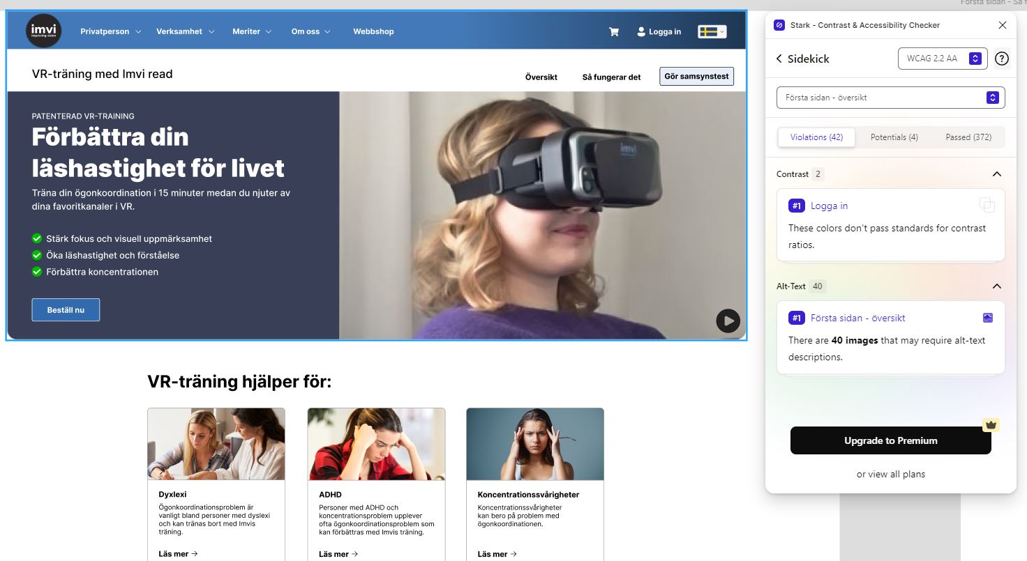
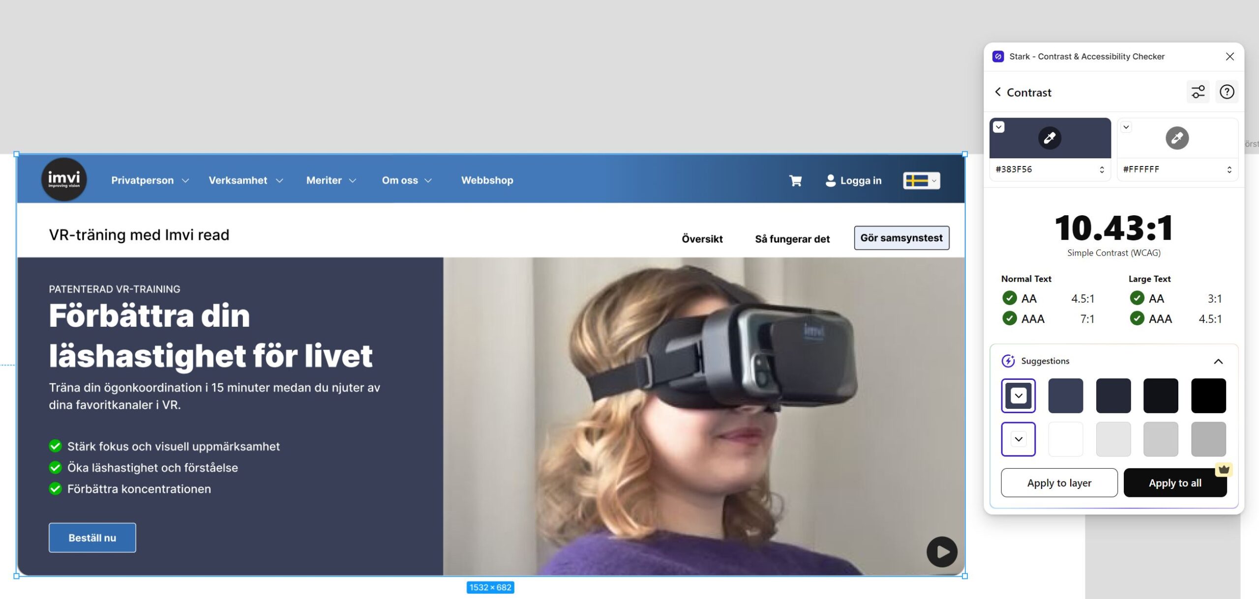
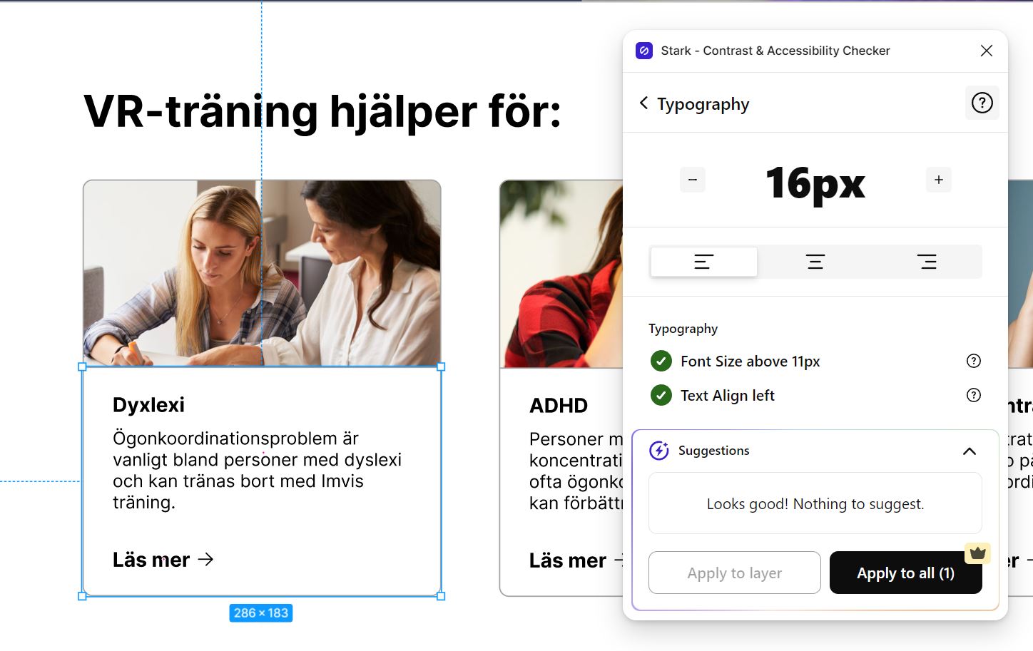
Implementing WCAG into the design
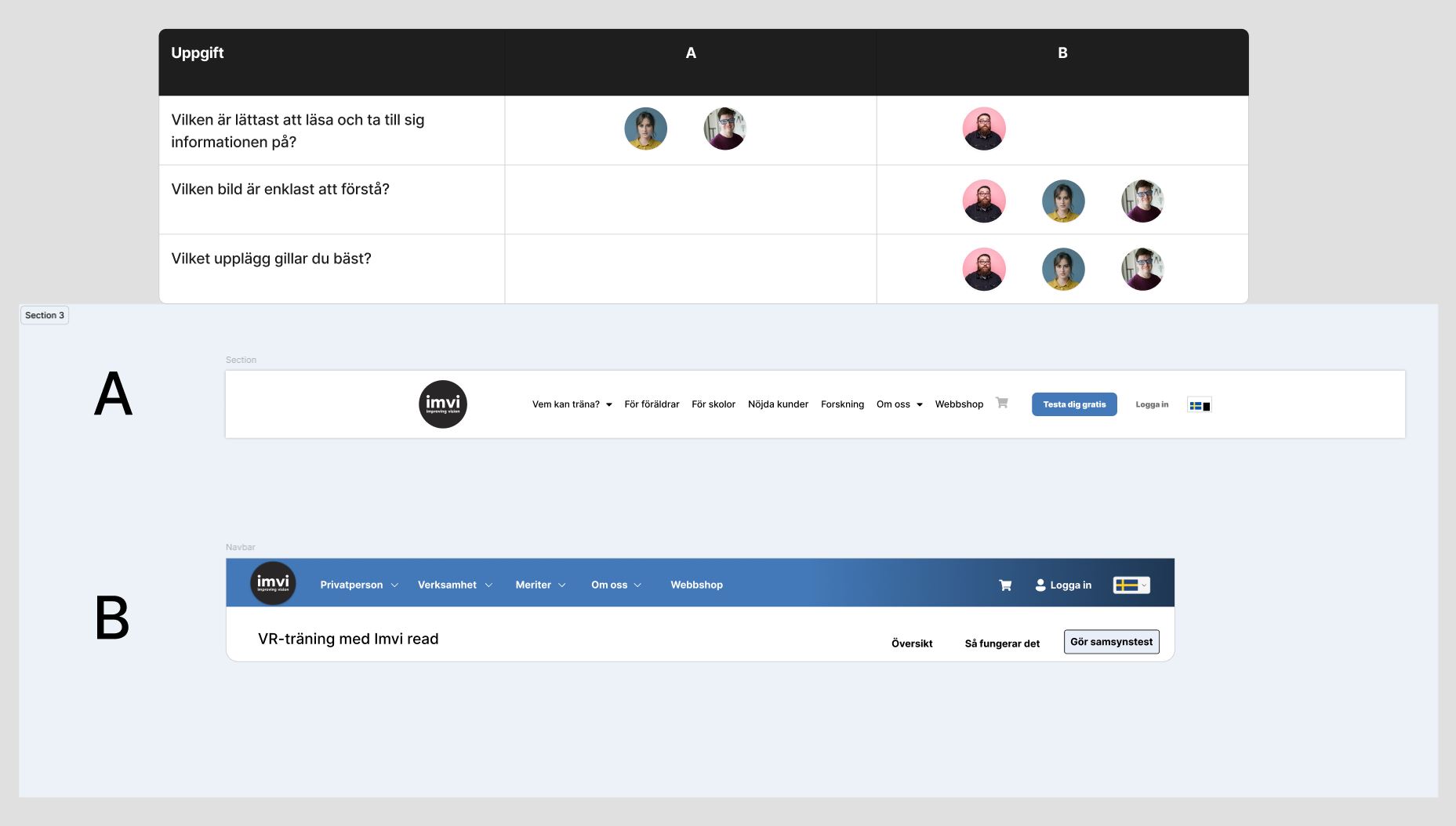
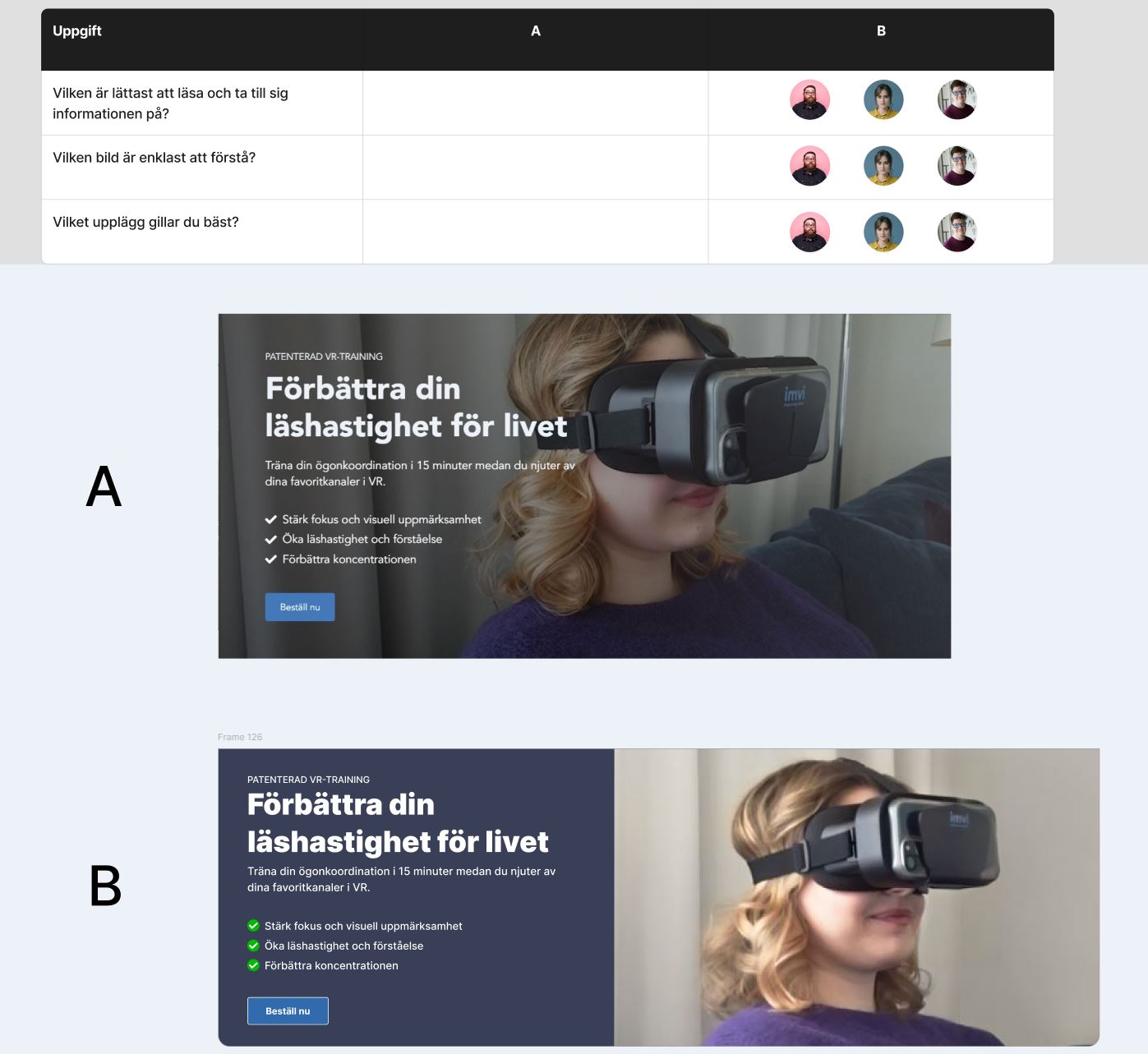
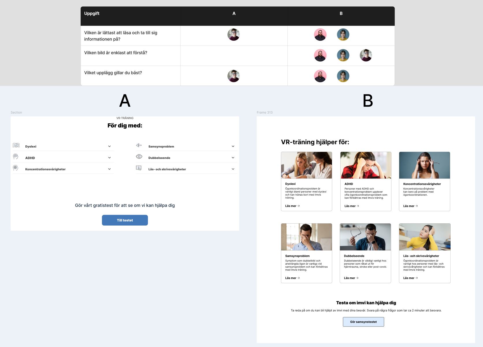
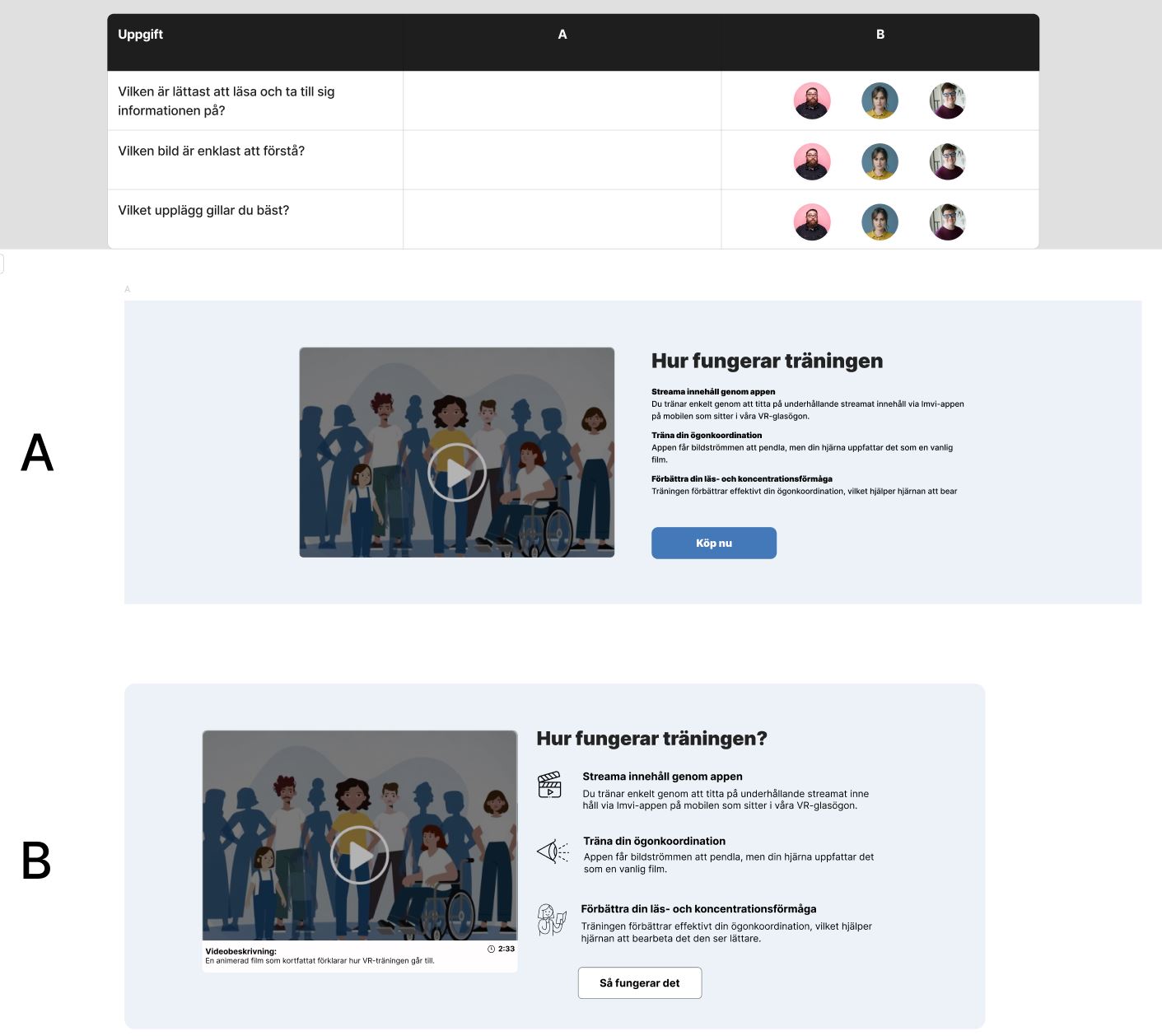
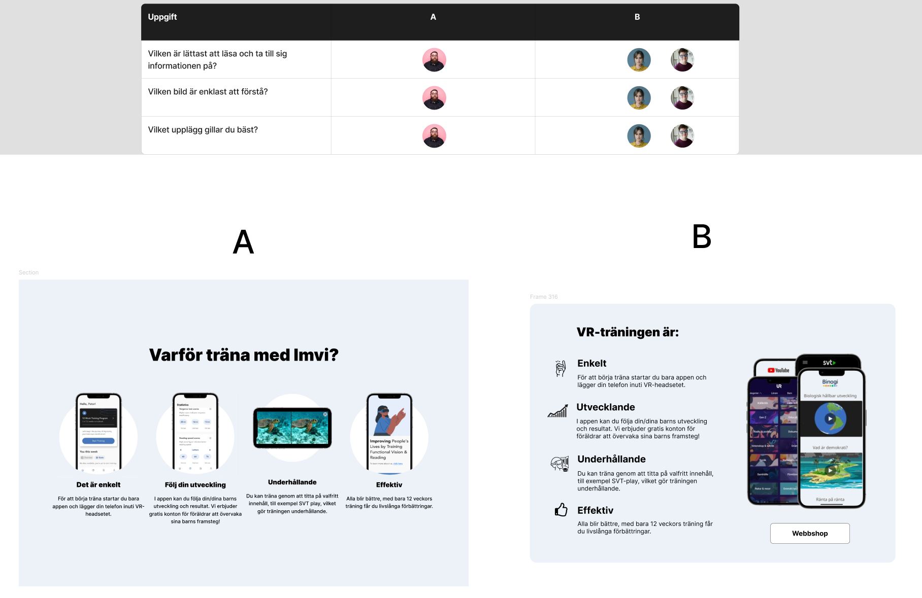
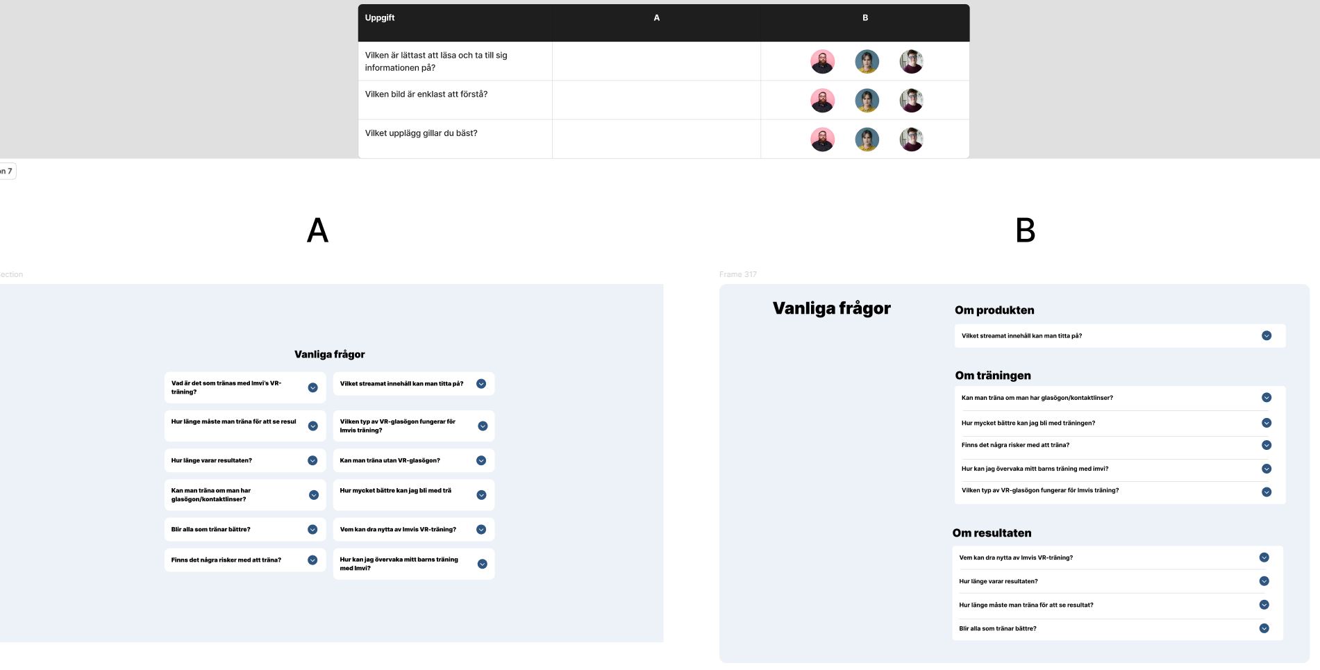
A/B-testing, user testing and prototyping.
A/B-testing
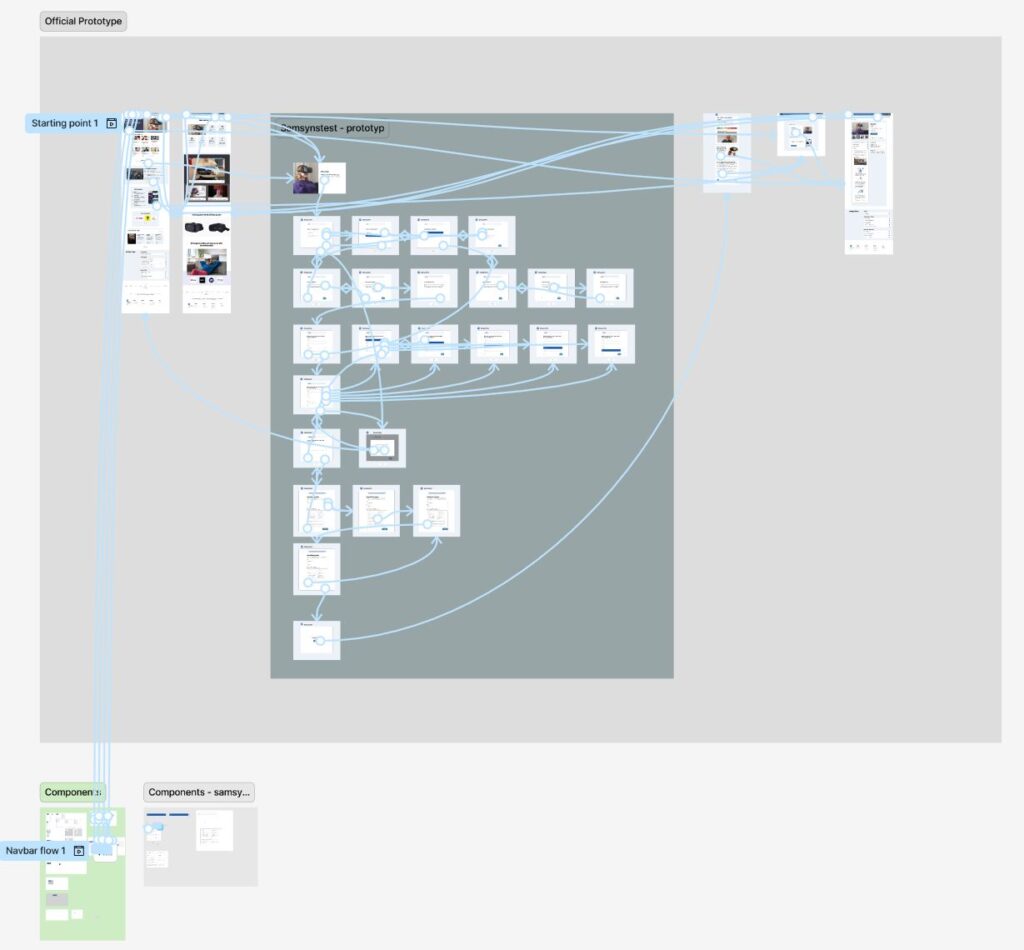
Prototype
User testing
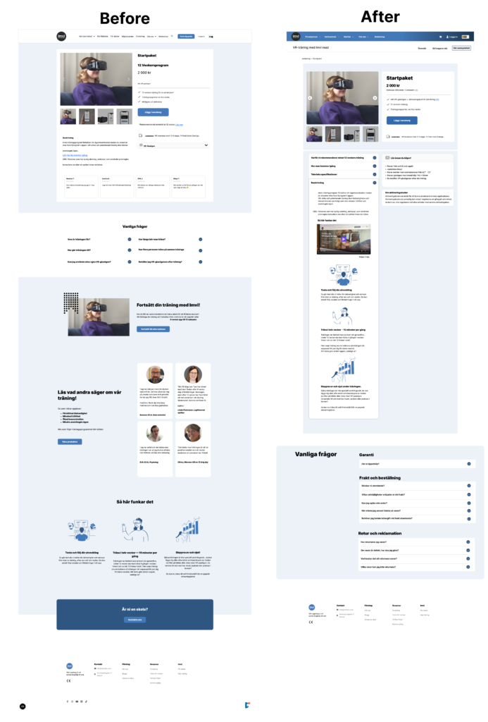
Before and after
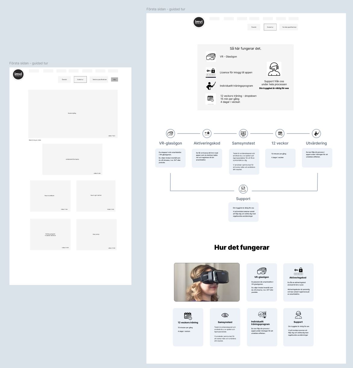
First page
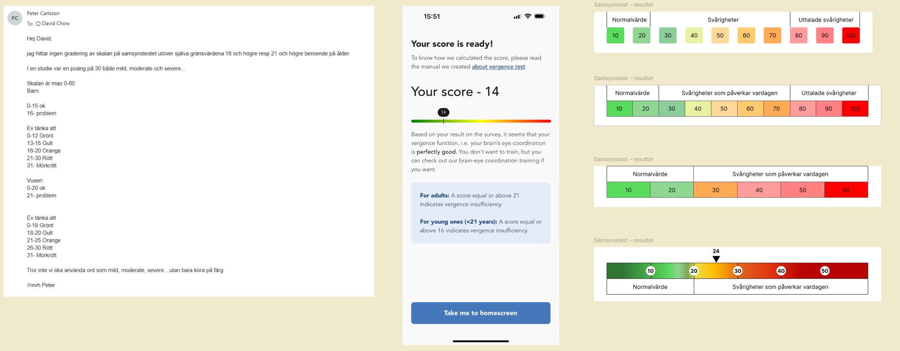
Vision test

Test result
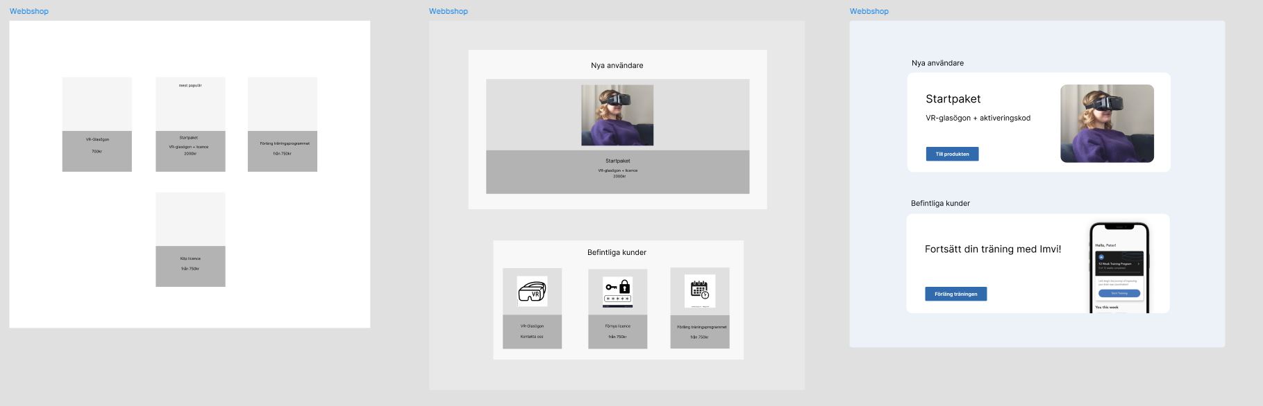
Webshop & Product page
Learning and take-aways
Question: Did we solve the questions from HMW – How might we’s?
The answer is: ”Yes” and ”No”.
From a WCAG standpoint there were many checkboxes achieved, but from a individual standpoint there is alot more work to be done.
Is it possible to create something enticing, playful and stylish combined with accessibility?
Yes, but it requires intentional design, quality control, and a commitment to inclusive guidelines
One of the biggest challenges was how to design something enticing, playful and stylish combined with accessibility. Is it possible?
- Yes it is, as long we follow the ”POUR” principles:
- Perceivable
- Operable
- Understandable
- Robust
Inclusive design is simply better design
This project showed me the importance of accessibility and inclusive design,
the amount of impact it can make in peoples lives.
The take-aways
- Accessibility should be implemented in a design system so we have a better foundation and working ground from the beginning.
- Without accessibility thinking it could be a great loss of knowledge and competence. A great example of this would be the great physicist Stephen Hawking.
- Technology should enable and not disable, we as developers and designers who creates needs to take responsibility for this matter.
The learnings
The individual:
- People with different disabilities needs more time and preparation for interviews and user testing.
- Research about the user, you should understand and map out:
- The persons abilities and disabilites.
- How long have the person lived with their disabilites?
- Is the disability temporarly or chronical/long term?
- How does the person handle their disabilites in their daily life through different activites?
- How much experience and knowlegde do they have about the specifik task? In this case;
- For instance internet shopping, using a smartphone or desktop.
- The level of independency in their daily life.
- Language skills.
- Any use of tecnical aids or assistive technology?
- If so; since when and how much is it being used in their daily life?
- People with cognitive challenges;
- A low fidelity prototype could be too abstract or vivid, it might require a medium or high fidelity prototype.
The environment:
- If possible, perform the usertesting in their home environment where they feel most comfortable and less risks of distractions.
- If possible, have a physical meet up to establish contact which benefits a better understanding for the user. This also enables a physical observation which gives more data in your assessment.
The task:
- Divide the task into minimal elements.
- Seperate the testing if needed, start with A/B testing and then see how they perform and react before trying a larger prototype.
- The difference of the elements has to be clear while peforming
A/B-testing (or else they wont be seeing any difference at all). - Avoid having more elements than A/B-testing (A/B/C/D…) because of the cognitive overload.
- Be aware of having more frequent breaks if needed, a short break could be a significant help before continuing.
- Guide the user if needed, sometimes they can get stuck on elements and lose focus fo the main task. Instructions can also be repeated.
- Keep it short, less is more.