UX-Prototyping
Challenge: How to improve the usability into their existing cloud based platform. The current platform are mainly designed by technicians which makes it difficult to comprehend for the common user. By using different design principles can improve the user experience and benifit for all users.
Platform: Mobile version.
The goal of this particular project is focused on their demo version so called ”EBLCloud”.
Reading time: 6-10 minutes
Role
UX-designer, Prototyping & Testing.
Project time: 4 weeks
(March-April 2025)
Working solo
Company
Sector
School project, Education, Real case
Quick access to prototype
Prototype language is in english
Background
Panasonic Fire & Security has a cloud based system for detecting deviations through their on-site fire alarms. A B2B strategy with both hardware and software.
Accessing the platform require the user to log in trough a web browser with a
2-step verification. The main users for this platform are service technicans but could also be used by other professions such as a local manager or property manager. The system can provide different services, such as notifications, type of deviations and administrating options denpending on their role and access level.
The purpose of this system is to increase efficiancy for how to handle deviations by enabling usage both on-site and remote.
User Story
One effective way to describe a product can be achieved by a user story.
I’ve created one to give this platform a context for the reader so it can be relatable and give a quick understanding. The scenario is divided into three follwong steps;
Stefan is the local manager for the Emporia shopping center in Malmö.
He receives a text message on his mobile phone stating that the fire alarm has been triggered in a specific area and that he should contact the fire technician.
He follows the local procedures and logs into EBLCloud.
He contacts service technician Erica and fire technician Matthew.
An evacuation takes place, and he directs people to their designated assembly points.
Stefan has completed his task and now hands over the matter to the technicians.
Additional information:
Stefan’s access level is “Local User View only.”
He has previously set up EBLCloud to send him SMS notifications.
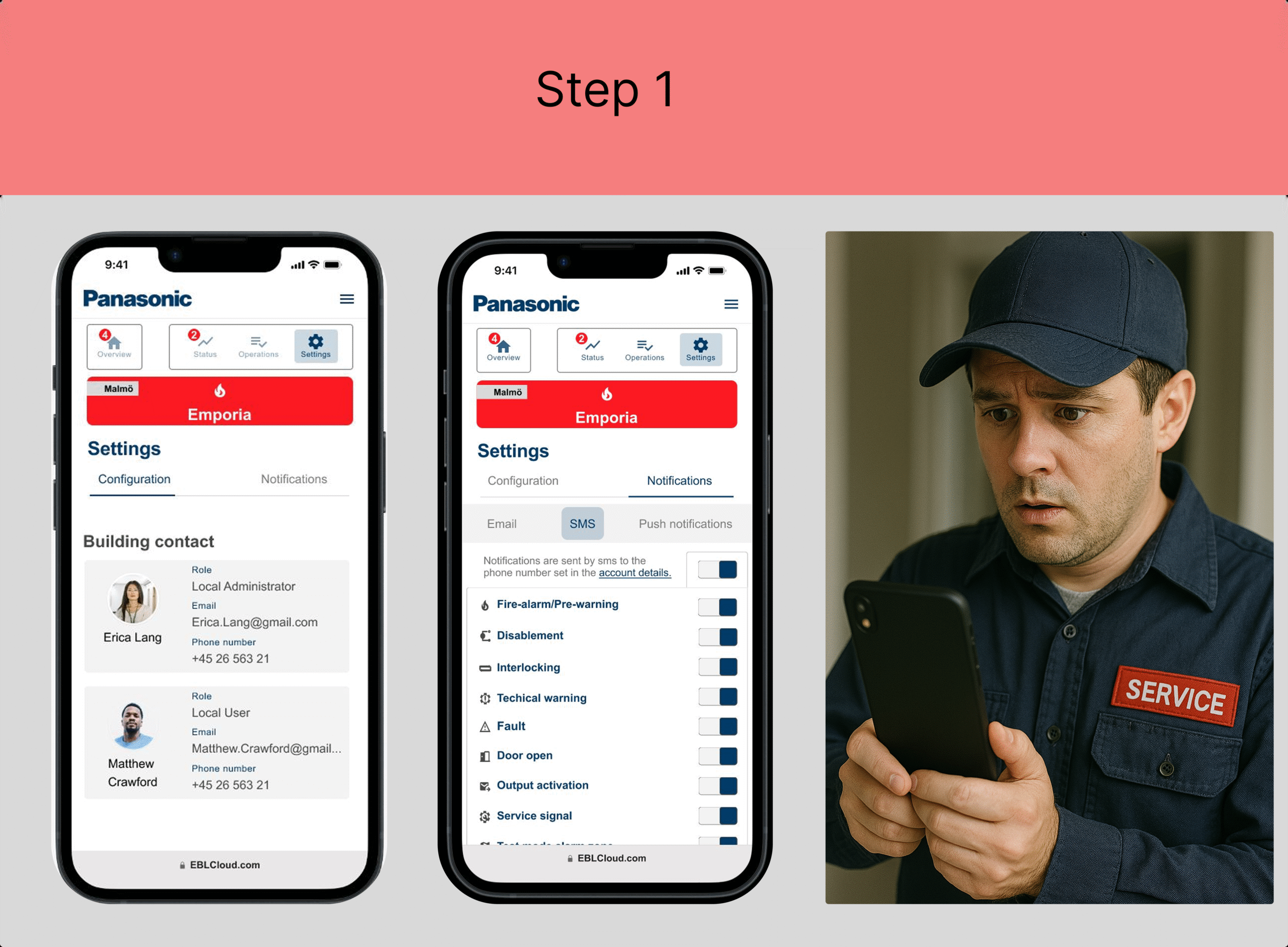
The fire technician Matthew is contacted by the local manager Stefan and is informed about the alarm.
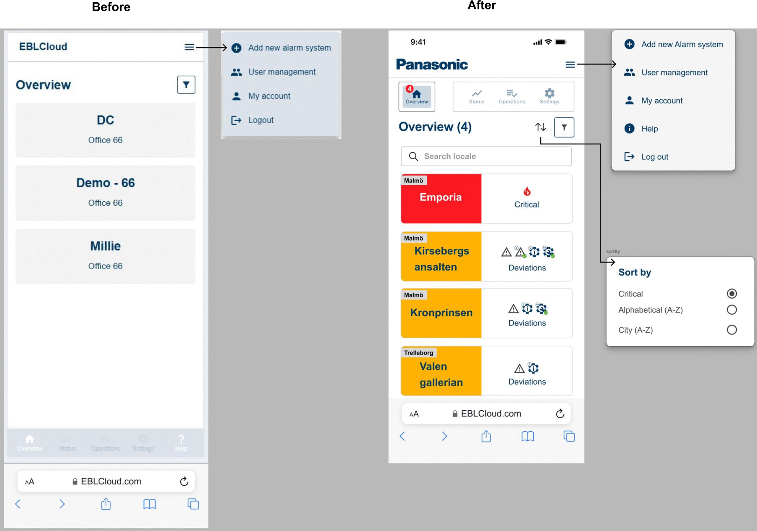
He logs into EBLCloud and sees that the Emporia site has a critical notification.
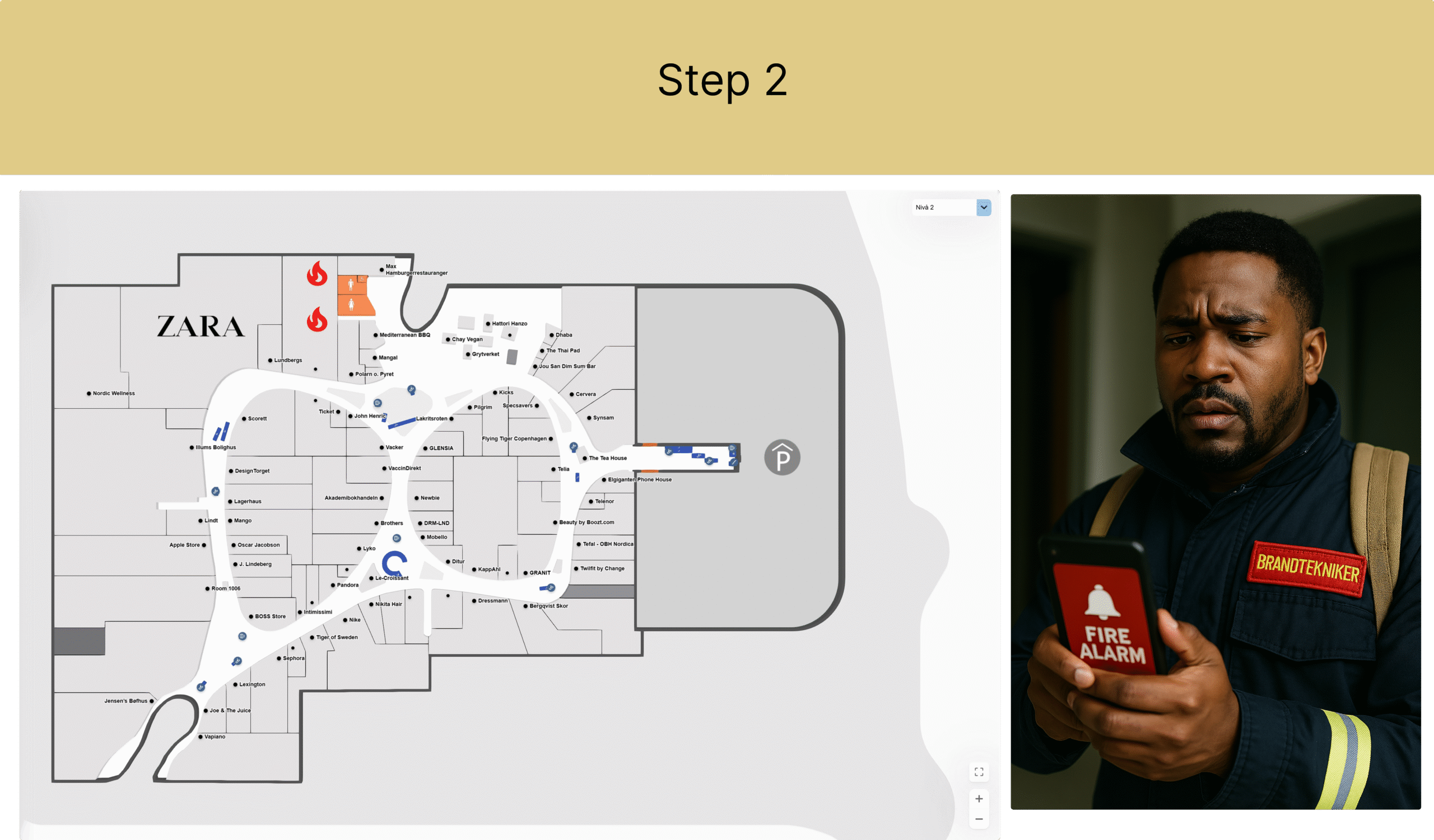
In the map view, he sees that the alarm originates from the Food Court near the restroom area. Two fire detectors have identified smoke. Matthew confirms the incident in EBLCloud and heads to Emporia to handle the alarm.
Additional information:
The fire technician has the access level “Local User” and can view more sites than just Emporia in his overview.
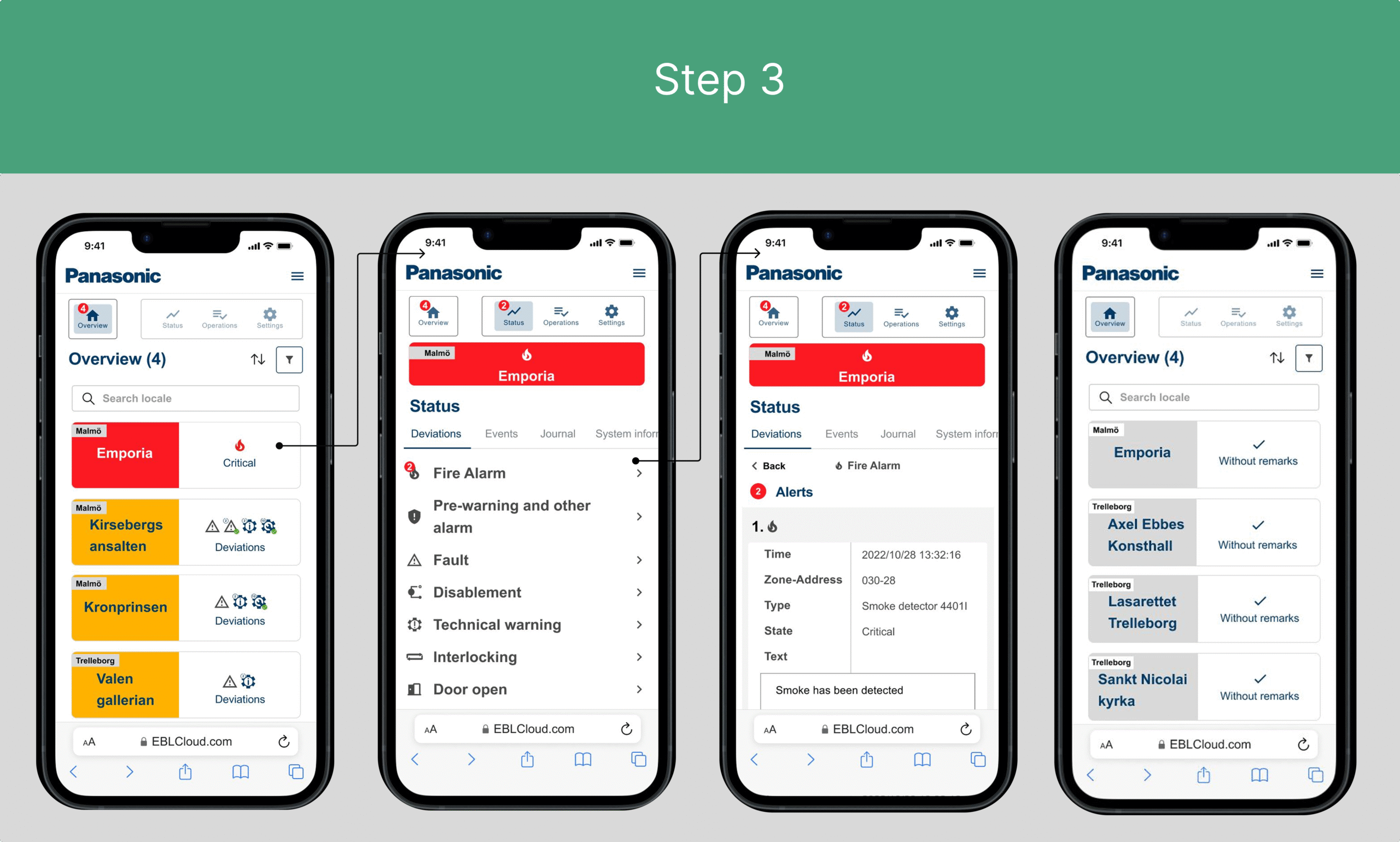
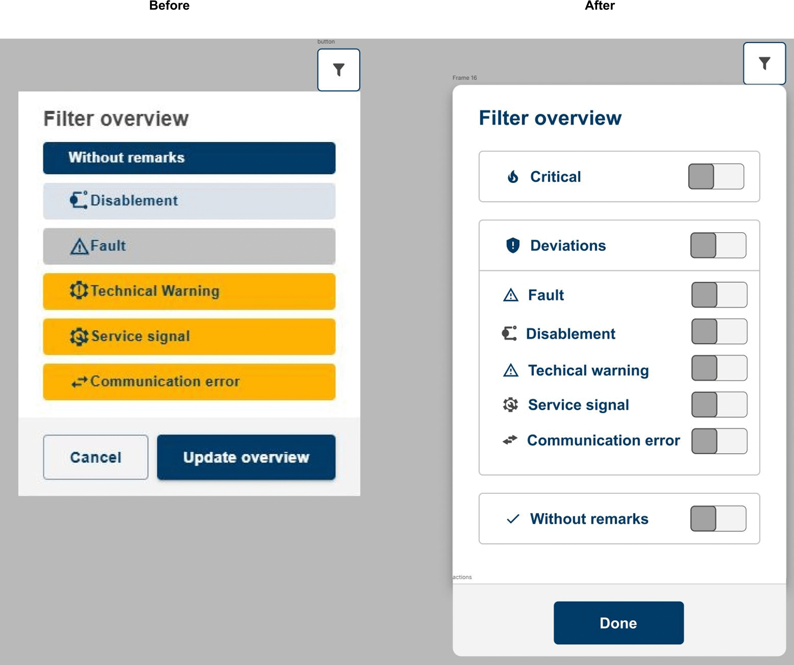
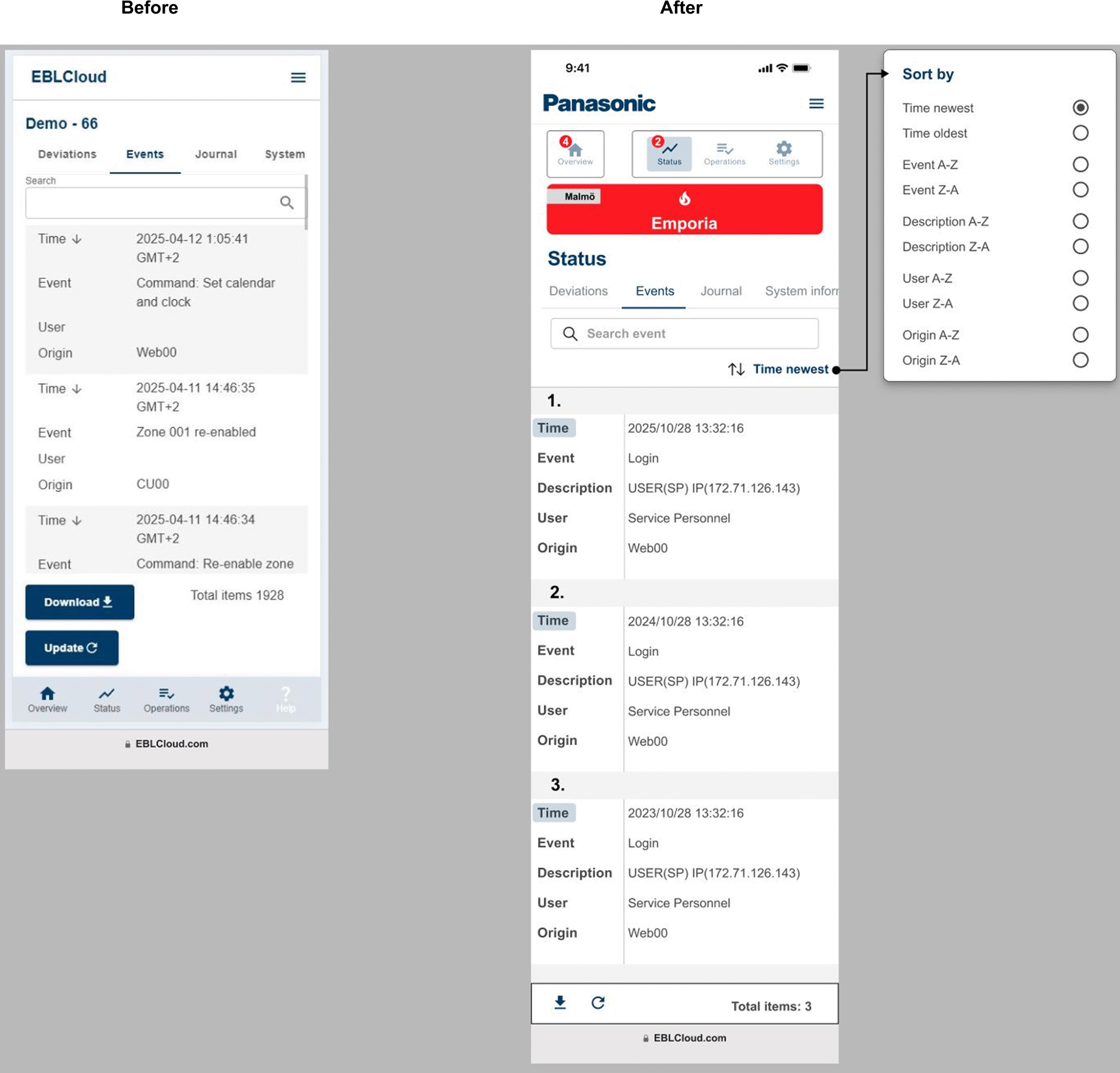
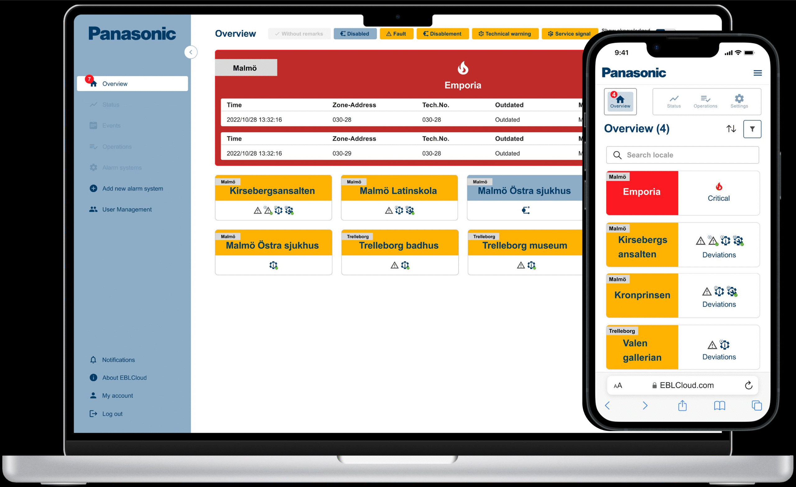
In EBLCloud, the system appears as follows in this scenario:
- The overview displays four sites, where Emporia is marked as critical with a fire icon. He clicks on it and proceeds to:
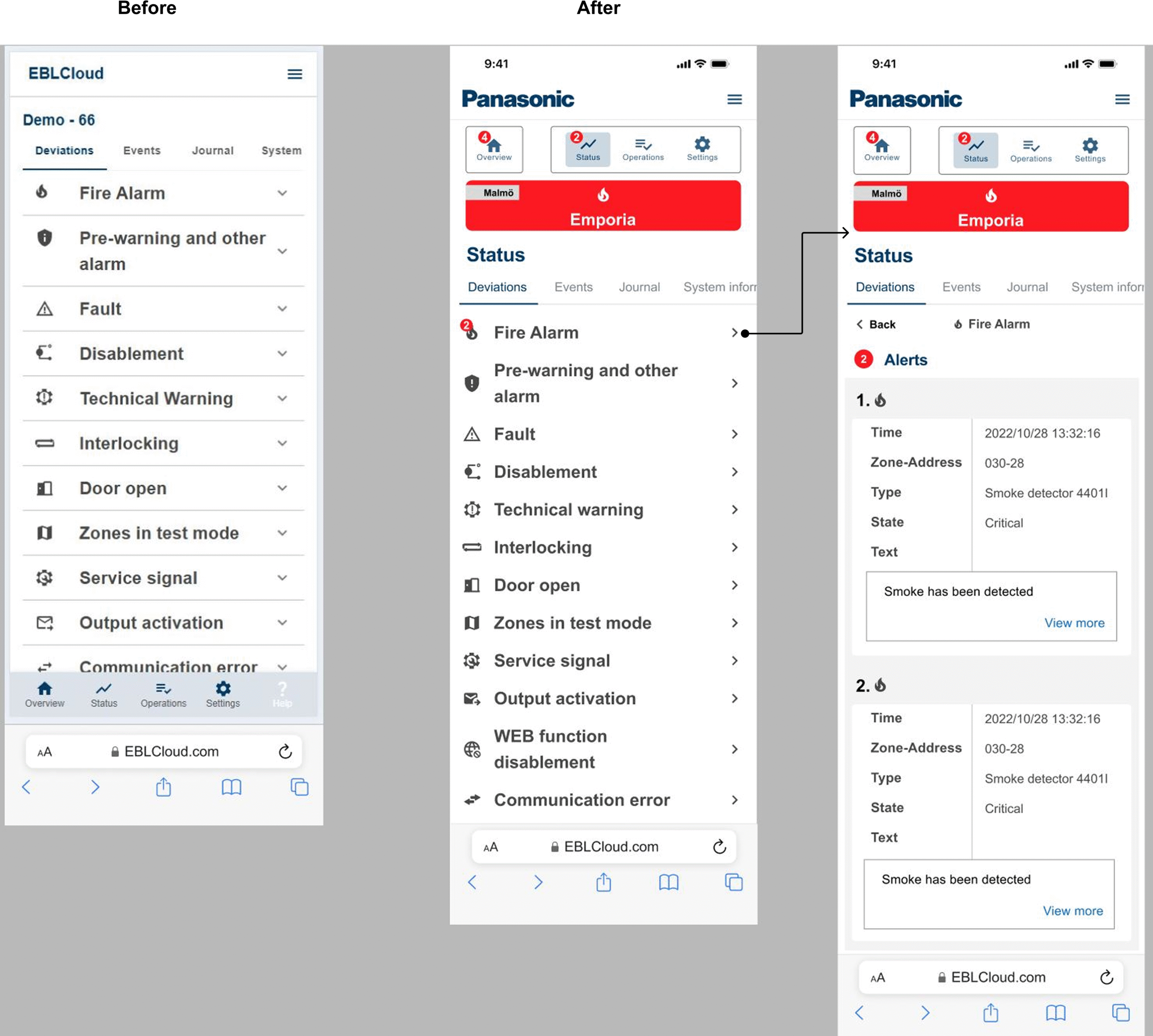
- The status page, which shows two notifications. He clicks on that and lands on a new page displaying:
- Two alerts with fire icons. The first detector indicates that smoke has been detected. If he scrolls further down, another detector, labeled as number 2 and also with a fire icon, will appear.
- Finally, the issue can be resolved and marked as cleared, which will then be relocated to a different overview, shown in the final image.
At this point, Emporia will be listed under ”without remarks.”
The Design Principles
Following design principles has been used for this specific project:
- Accessible design – Should be usable and understandable by all people, regardless of ability or functional variation.
- Balance – That the elements are proportionate with the design
- Context – The platform should be usable even in a stressful environment.
- Contrast – Related to accessibility by making it clear to see the different elements; understanding what belongs to what and being able to distinguish between them.
- Scale – Ensuring that icons, components, and similar elements have enough space.
- Usability – The ability to immediately understand, learn, recognize, enjoy, and easily handle the product.
- Visual hierarcy – That the elements appear in the correct order by guiding the user logically on how the eyes should follow the flow.
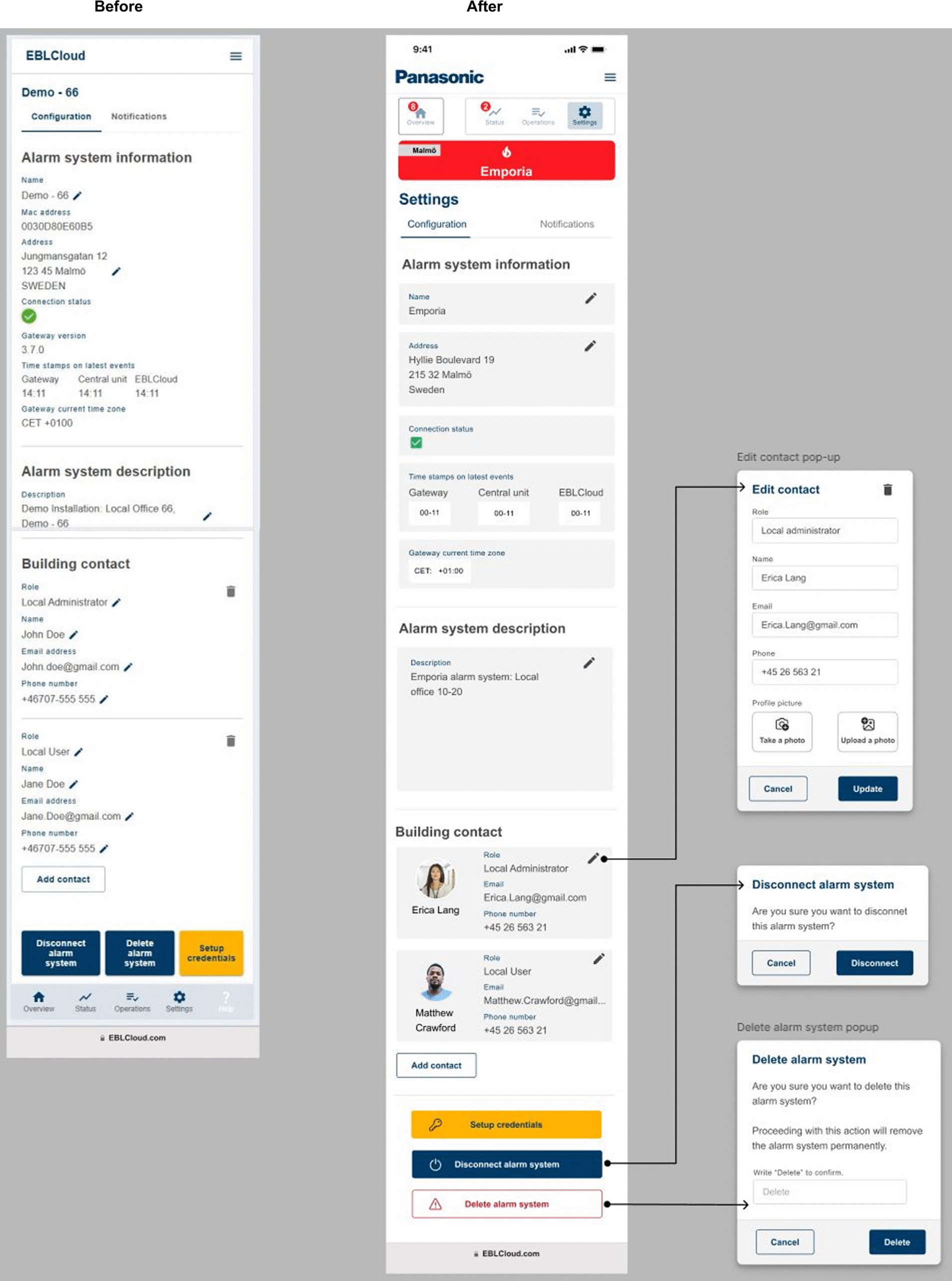
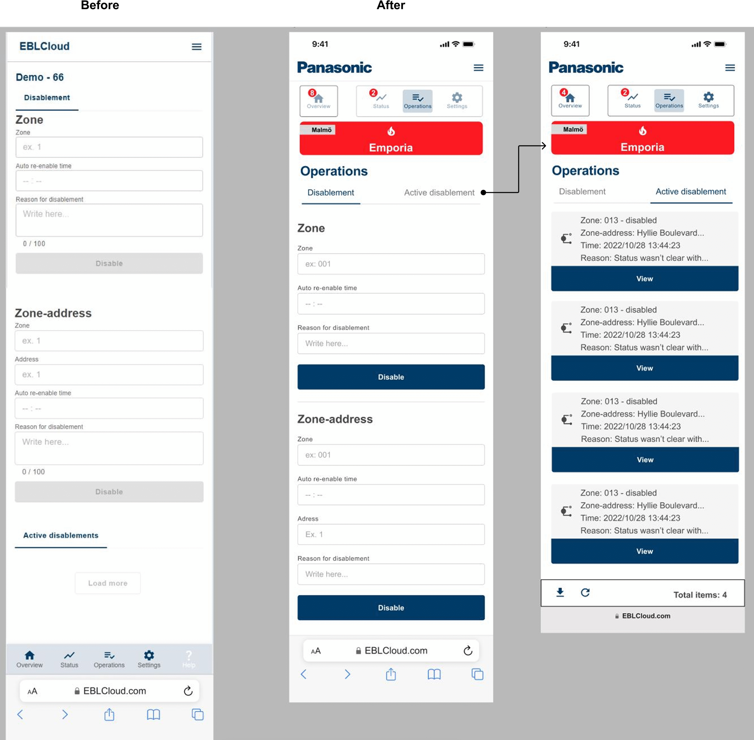
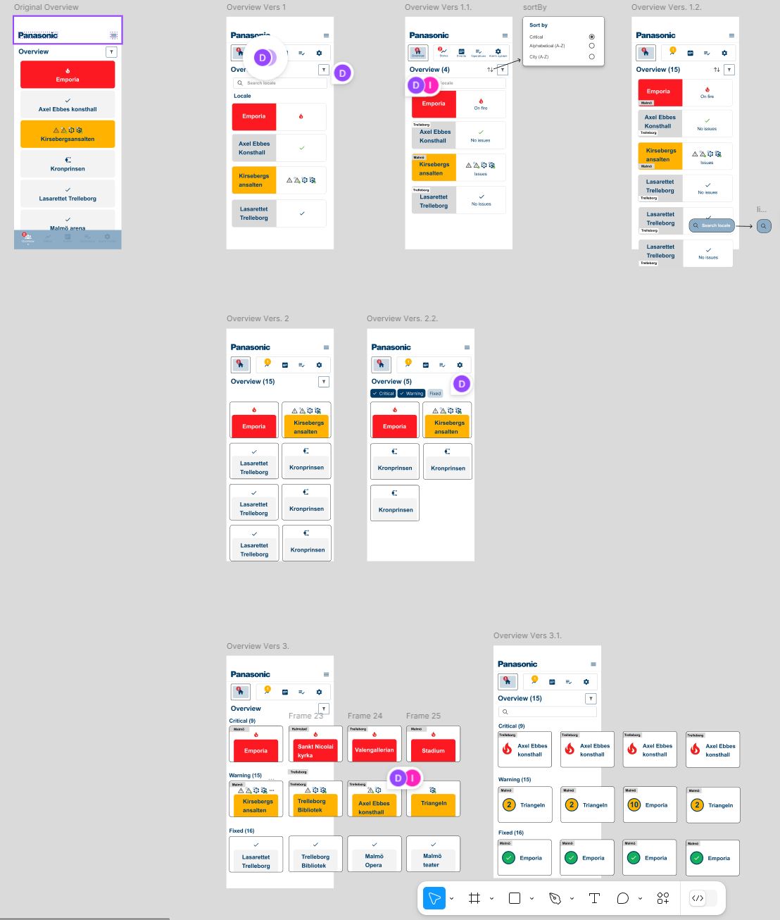
Early prototype stage
Stakeholder has been involved early in the process which gave guidance, insights and decision making through the design process. Platform Figma has been used for showcasing every step of the way. I’ve created at least three different versions of each mockup with a low fidelity which by time has been evolved into higher fidelity which represents the company’s styleguides and components.
User testing & Results
I had the opportunity to test the prototype on five individuals aged between 30 and 50. While the prototyping process was initiated early, it proved challenging to gather meaningful data without providing proper context regarding the technical elements. As a result, the insights from the initial tests were not very effective.
To address this, I introduced a user story before starting the user tests. This approach provided context for the project, leading to a much deeper understanding among participants. During the final phase of testing, I also presented the current demo version of the EBLCloud, allowing users to compare the designs before and after implementation.
Here are the results from the user testing:
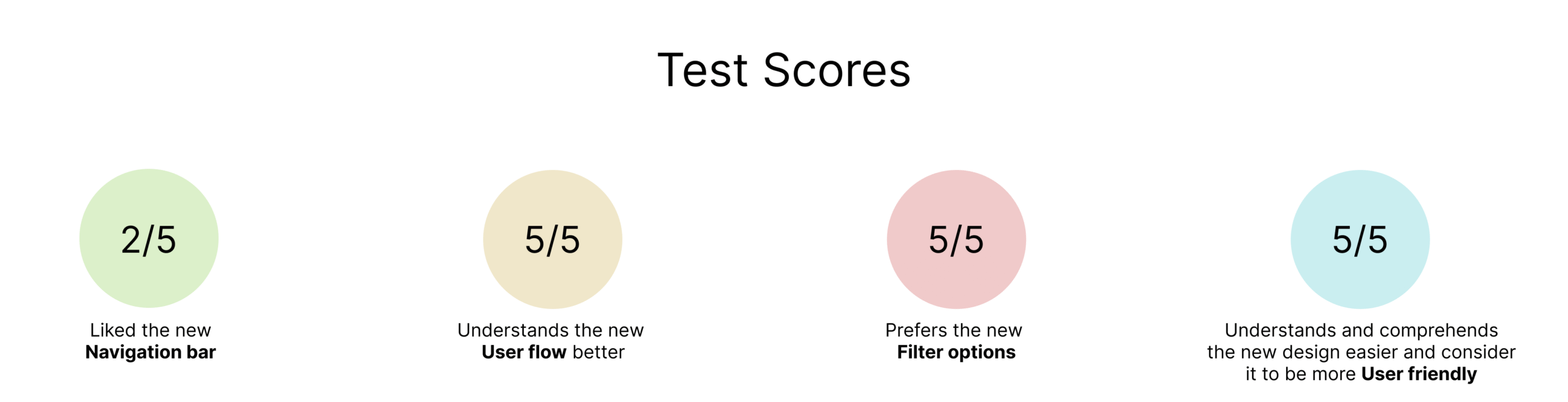
The results indicate a significant improvement compared to the current demo.
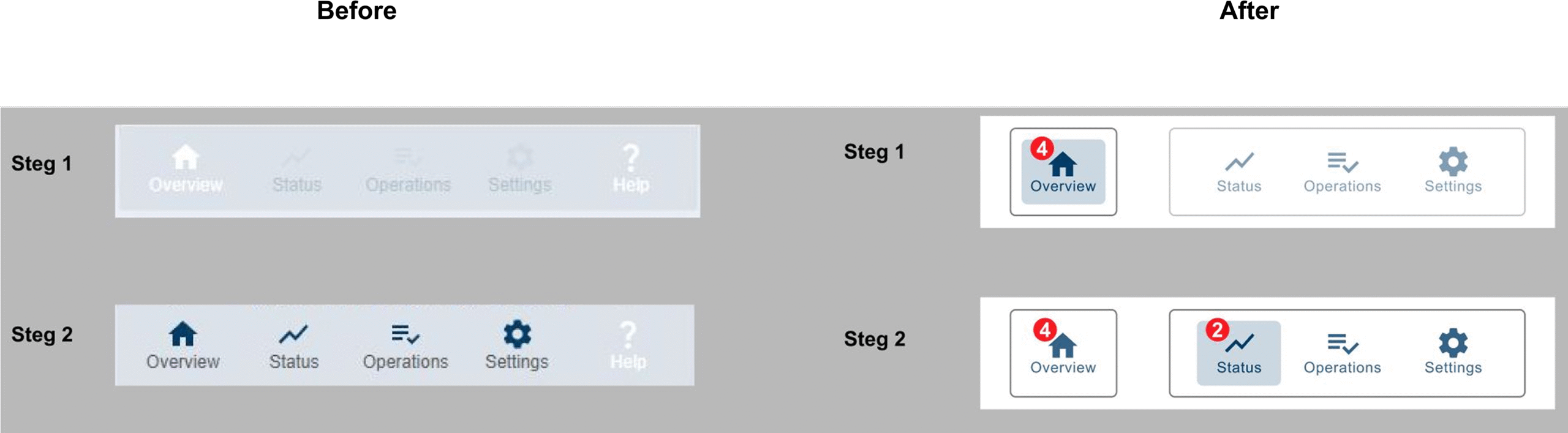
The next step involves working on the navigation bar. Currently, there is a lack of a clear hierarchical structure, which confuses users into tapping on the shortcuts
(status, operations and settings) even though they are not functional, as indicated by their low opacity.
The hierarchical structure of the navigation bar is outlined in the image below:
1. Overview
2. Locale
3. Status, Operations, Settings
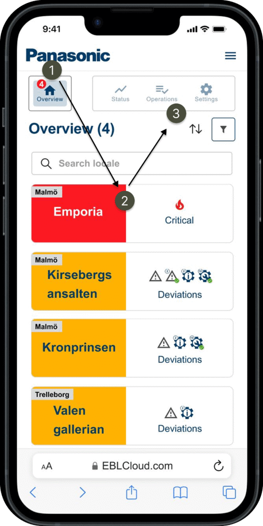
As shown in the picture, the shortcuts (number 3) for each locale wont be highlighted and active until a locale has been chosen. My approach to this matter was to separate the ”Overview” button with the rest, but the challenge still remains. My next step would be trying new designs and prototypes for the navigation bar to see if this challenge can be overcomed. I started sketching and came up with the following designs;
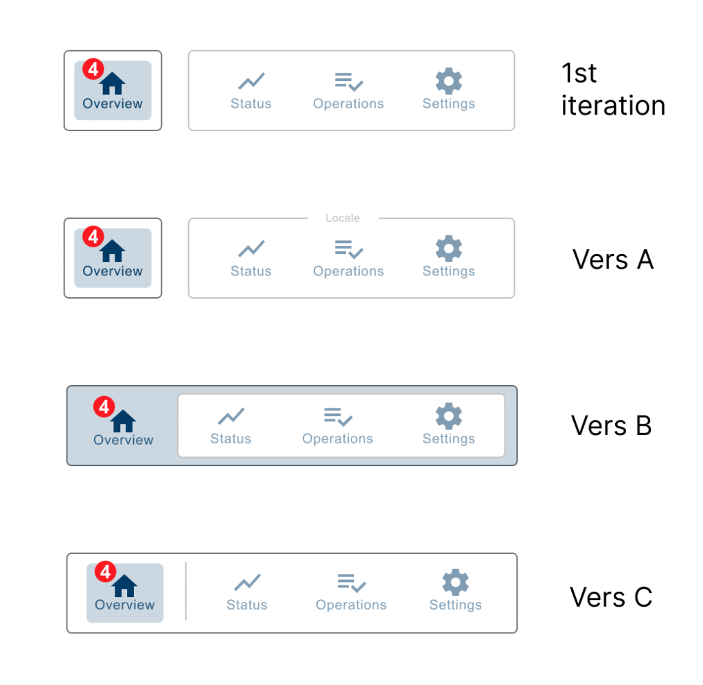
How might we try out these new versions (A-C) of the navigation bar?
There are many ways to go about it since prototypes exist in many different forms. Here are some examples;
- Paper prototyping – hand drawn or print outs.
- Narrative prototyping – giving the user test context.
- On device prototyping – a real device to try it on, in this case a smartphone.
- Clickable prototype – with interactions, the user gets direct feedback.
- Live data prototyping – the elements contains real data and text which reflects the end product.
The options can be overwhelming, but in the end it comes down to two options that is essential in your prototype;
- Option 1 – With interactions: Clickable.
- Option 2 – Without interactions: Non-clickable.
In a clickable prototype, programs such as Figma can implement interactivites such as colour change, highlights and animations during interactions.
This could be more time consuming in the design process but be essential for the user experience.
In a non-clickable prototype you can simply show-case the mocups and describe to the user whats happening in a given scenario and asking questions combining with ”think-aloud” method. This way is fast and efficient which also leaves more room for the imagination, but could also be more risky for misinterpretations such as unclear instructions or language barriers.
My approach and reflections for testing the new versions of navigaton bar:
I believe by simply asking and comparing them side by side without given context would not justify the data outcome because it could easily be misunderstood.
All users have different perceptions of an idea depending on what data has been given to them, especially when it comes to elements with interactions such as a navigation bar.
A good way for testing interactions can be used within Figmas features in the prototype settings, for exampel implementing interactivity such as animations.
By using animations can reduce the misconception of an idea and filling in the gaps thats been unclear to the user. This also benifits the way for presenting and bringing out a better user experience during a user test on a prototype.
My approach would be making clickable prototypes on a device with Figma.
Prototyping each version individually with given context combining with animated interactions, such as color change, smart animation, highligts, fading in/out etc.
This will more likely ensure the user for understanding your concepts and ideas regardless of language barriers, cognitive disorder or the users technical background.
Take-aways
Prototyping is a great way for communicating from an idea to an actual product.
They are disposable and therefore important to define how much time is spent on them. A proof of concept which has one main purpose; reaching the final product.
Prototypes exists in many different levels and therefore up to us designers to utilize it where it fits best.
This project has shown me how powerful prototypes can be by introducing it in early stages even though its very unpolished and unfinished. By having a mindset of ”less is more” and introducing it to others (users, colleagues etc) can bring early guidence and angles into the creative process.
Before & After